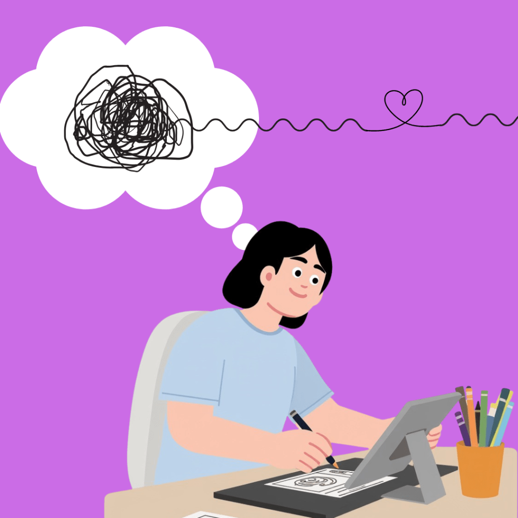
Motion graphics can look really cool, but they can also get confusing fast. Trust me, I know. If there are too many effects or things moving at once, people won’t understand your message. Good motion design is not about doing more, sometimes it’s about doing the right things in a simple way.
So if you want to make your designs all the better, here’s some tips you should try!
1. Start With an Naviagatable Idea

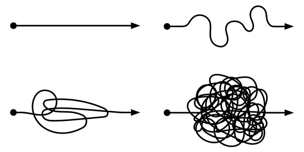
Before you even open your software, think about your goal. What do you want people to learn or feel? Motion graphics is one of those unique fields where storytelling plays a role. You don’t need a big budget or a grand idea. By having your idea follow a specific navigation, or literally just going from point A to point B, you have a way for the user to follow your movements while still being simple.
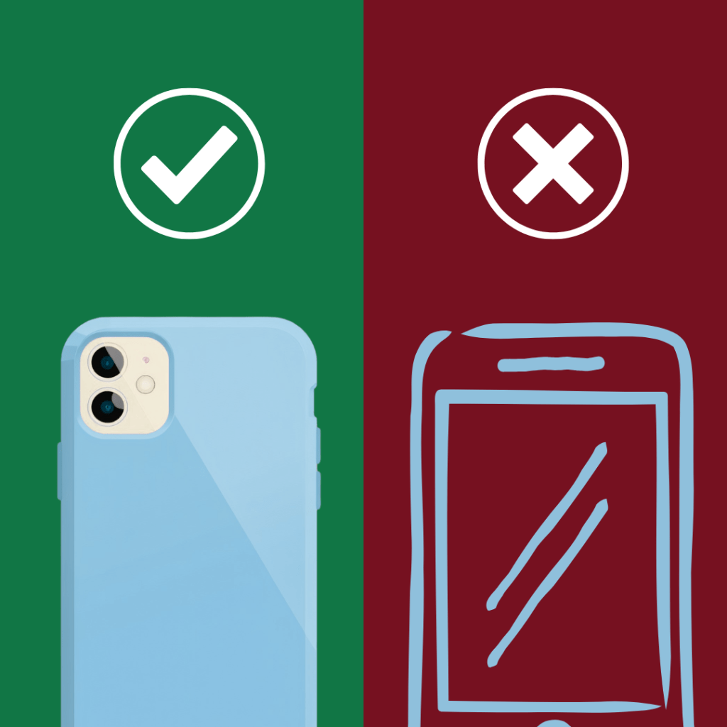
2. Learn to Simplify
I have fallen victim to this. Its tempting use every color, effect, and transition. But too many will be distracting and overwhelming. People can even get lost or even frustrated if they can’t even tell what’s going on. But if you keep it clear, people stay focused.
Try using:
- Fewer colors
- Simple shapes
- Clear text (sans-serif tends to be easier to read)
- Proper spacing between items
A great designer knows the difference between correct design and too much design.
3. Use Motion With Purpose
Motion graphics are about movement. But you got to know what movement is appropriate for your motion graphic. Every animation should be made with a certain intent. For example, one of the 12 foundations of animation is physics. This means that movement are affected by the things around us.
For example, if you are making a graphic where letters are zooming on screen, having a motion burr effect would add to the graphic because our eyes cannot visualize fast movement. So, good motion design connects what people see with how they understand it.
4. Stay Consistent
Something people forgot is consistency. Everything should feel like it belongs together. If your animation keeps changing styles, it can feel messy. When learning how to be consistent, you should consider:
- The same colors
- The same font
- The same animation style
- The same speed of animation.
You don’t want your motion graphic to feel too jumpy or too jarring, because it will make your graphic feel incomplete. Keeping consistency means helping your audience feel comfortable and understand your message faster.
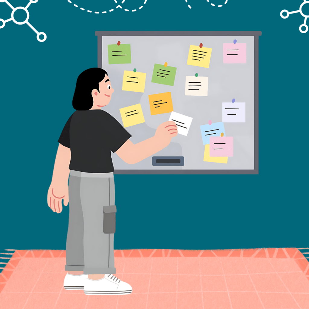
5. Test and Improve

Even if your animation looks amazing in your eyes, it might not be clear to others. That’s why testing is important. Sometimes a “fresh set of eyes” can truly be helpful. And outside testing and review can be quite useful.
When you look at classic critique systems like peer review, people found that analyzing people’s content can help find improvements and even bring about better ideas that could advance a product further. Motion graphics is no different. Small improvements can go a long way.
Final Thoughts
Motion graphics don’t have to be complicated to be good. In fact, the best ones are often the simplest. A lot of my motion graphics have gotten better the more simple they got. When you focus on learning to simplify, your motion graphics will not only look better, they will also work better in the long run.

Leave a comment