
One of the most interesting jobs I worked was as a retail associate at Cumberland Farms. I had the pleasure of meeting all sorts of people! But one of the things you see is how your stores app works and how people react to it. From this experience, I learned one major thing. An app fundamentally on good UX and UI. But why?
What Makes an App Good?
To know what makes a good app, lets get a definition to what design components exist to make an app. There are two major areas: the User Interface and the User Experience. What are they? Well, Figma defines the two as the following:
In digital design, user interface (UI) refers to the interactivity, look, and feel of a product screen or web page, while user experience (UX) covers a user’s overall experience with the product or website.
But what does that exactly mean? Well, a user interface includes buttons, colors, fonts, hierarchy and overall feel of a page. User experience meanwhile focuses on how user goes through said interface. Can you get from Point A to Point B. Both are needed.
UX and UI are Required to Make an App Successful
Both hold their challenge. UI has to be good. Things must feel complete, all while finding that great medium of simple and complex. UX meanwhile makes a product worth it. You are having to make a user doesn’t get frustrated or lost. Although, there are many ways you can tell if you were successful.
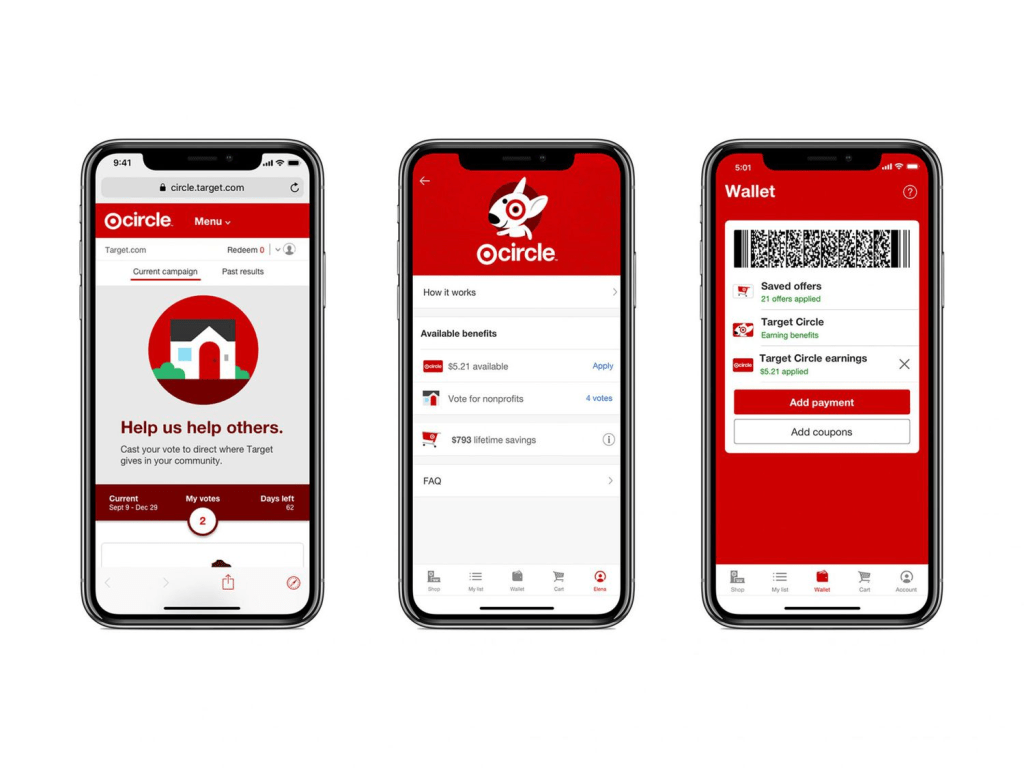
Lets look at a good example of a good UX and UI through the Target Rewards App. For UI, notice the colors, the separation, the text fits, everything has a place and it fits. For UX, look at the bottom especially. See how the icons are colored? This indicates that you can tell what page you are on and how to get there.
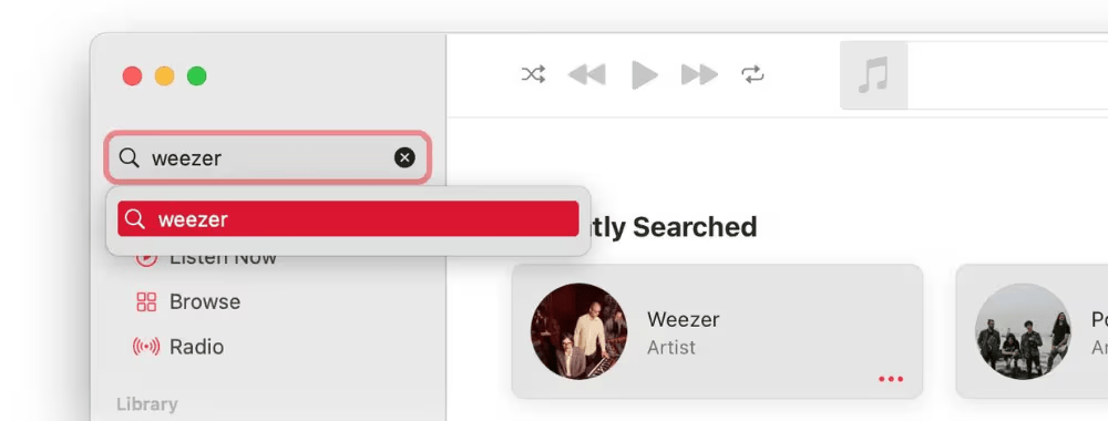
Lets look at the bad side of the UX and UI. In the Apple Music screenshot, “weezer” is massive and goes over the edge. This search definitely puts a sour taste in people’s mouths. Because of how often a user would use the search, the big stretch may interfere with other parts of the app.
And bad UX and UI does matter, as 88 out of 100 (88%) people visiting your digital product may not return if both are bad. That harms the business, but also the consumers. As someone who was on the front lines, I watched many people get lost, sad, frustrated, and more because they couldn’t find what they were looking for or didn’t know what areas led to where.
How We Can Do Better: Cumberland Farms
Since UX and UI are so important, how can an app like the Cumberland Farms Rewards App improve? Well there’s actually a lot they can do! This is based on my own personal experience and from looking the app over front and back as a designer. Lets look at some of the pages.
The Good
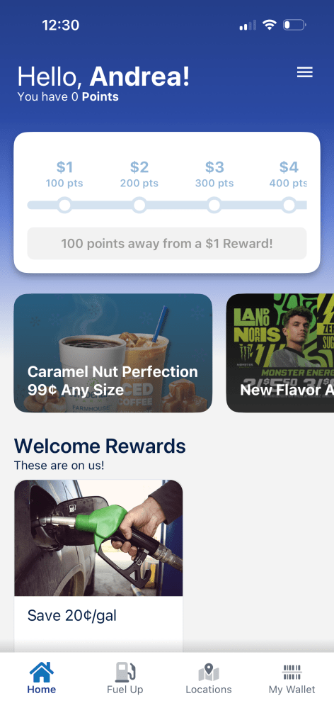
For starters, not everything is bad. On the UI side, the app has good hierarchy, the icons are constant, the design is simple, and everything is nicely spaced out. On the UX side, you can tell where you are, mostly everything is linked, and its overall easy to manage.
The Needed Changes
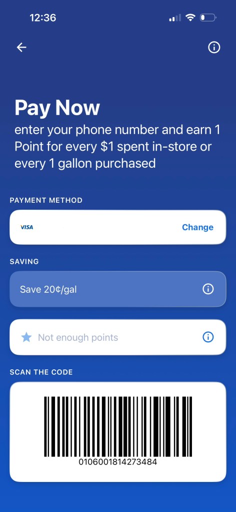
But some changes are needed. For UI, the colors and buttons. Cumberland farms utilize its logos greens and yellows to make the app more vibrant and match their stores. The buttons also should be properly linked or make sense, as some don’t open, are linked wrong or worse, don’t exist. If both buttons and colors are fixed, you have a more friendly app both design and interface wise.
But if you don’t fix UI, now the UX suffers. One of the biggest complaints I found were that customers struggled with payments and support. Not everything was linked or available so customers couldn’t tell if they were paying with coupons vs paying with card. There was also no such page or support that existed when the payments failed. If the links were available or there was a route to get to support, then people would be less frustrated while using the app.
Why I’m Telling You This
The reason I am telling you all this is because I know UX and UI. While working, I could see the problems there, and I understand when customers yelled or got frustrated. They want a solution. If the solution doesn’t exist, what’s the point using an app?
The app does have good qualities already there. But if companies don’t learn how to change UI and UX for the better, then you are 1. missing out on so much opportunity, but also 2. you are ruining an experience that can make customers happy and can make part of your job easier. Take this for someone who has seen physically worked with the people and the app made for them. Good UI and UX goes a long way.


Leave a comment