A logo isn’t just a neat way of showing what you do for a living, but it’s also a great way to express who you are as a creator! Because while a logo is a brand, it’s also a creative statement on what style you use. And this week, I have been given the opportunity to animate my own logo! Let’s explore the fun and creative process behind the product!
Animated Storytelling of the Week: Technique
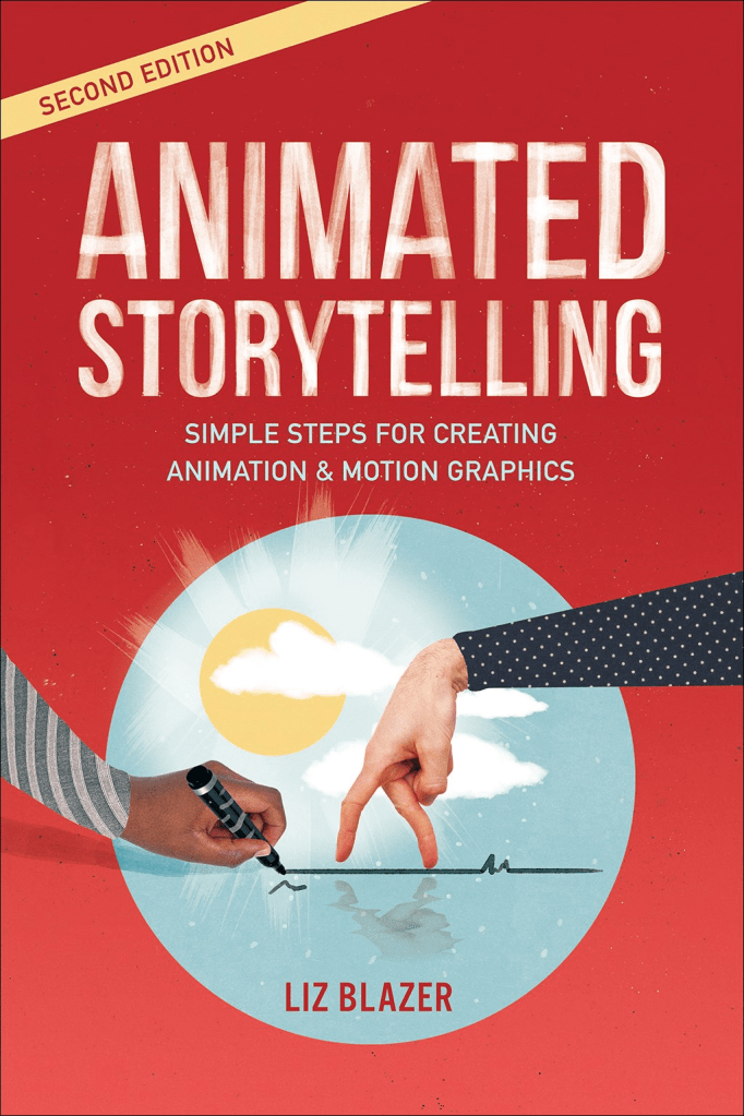
To start the week off strong, we have Animated Storytelling by Liz Blazer back on the menu! And this week’s chapter is number 9: Technique. Blazer explains that with animations come a lot of techniques and styles that could be pursued. She first explains that you must be ready to format your story. So where could it be shown? Is your story following something like classic TV or shown in movies/festivals, etc?
Once you consider this part, we next translate our story into a technique/style. There are many techniques of animation, like stop motion, hand-drawn, 2D, and 3D CGI, to name a couple. You can stylize these types of techniques to fit your animation. This part was my favorite because she explained that you could also mix these animation styles together.
Lastly, she mentioned possible workarounds to make any style easier. You could import still images, shoot live action footage of content needed, and even hire/staff up on people to help make any animation style easier to complete. This was a short but fun chapter.
The 12 Principles of Animation
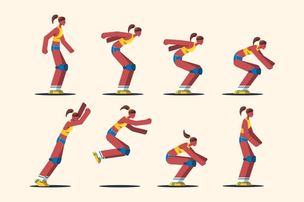
Once you have a style/technique for your animation, you now go into how you will showcase your content. What do I mean? I mean, techniques that are used to create a sense of world building that feels a good mix of realistic and entertaining. And one of the best ways to accomplish this feeling is Disney’s 12 Principles of Animation. They are a set guideline of ideas that can make your animation have a sense of life. They are the following:
- Squash and Stretch
- Anticipation
- Staging
- Straight Ahead Action and Pose to Pose
- Follow Through and Overlapping Action
- Ease In, Ease Out
- Arcs
- Secondary Action
- Timing
- Exaggeration
- Solid Drawing
- Appeal
And with these techniques, you too can not create your own animation with style but also see how in some of our favorite animated media how they bring a complex world to life. So lets look at how these sequences do well and how an animated logo could learn from them.
The Wind Rises: Secondary Action, & Solid Drawing
One of the most beautiful and heart breaking films I’ve seen is the Wind Rises by Studio Ghibli. But there’s one impressive scene that deserves like 5 Oscars for its animation sequence. Although the clip is only 4 seconds, look at what is happening in the scene.
Everything about the scene feels real. The pushing in the crowd, the wind blowing peoples hairs, the carriage barely because of how heavy it is, the horse and its mane and there’s so much more. Its incredible to see how realistic and fluid everything feels. Best part? All of that is hand-drawn by one person.
Doctor Strange: Anticipation & Appeal
Oh my favorite Marvel movie. The first Doctor Strange movie is a masterpiece. And I think the most impressive part of the movie is when the Wise One opens Steven Strange’s mind to magic, showing how little he knows. But why this scene?
There’s loads of anticipation, and its used to the advantage of the movie. Strange doesn’t know what will happen next and neither do we, so we are constantly on change on what go next. But there is also appeal. We know Strange is going through one of the worst periods of his life, and is currently stuck in his ego. So once we see him go this experience, our appeal of him changes to one of curiosity and wonder now that he knows magic exists.
Looney Tunes: Exaggeration & Ease In, Ease Out
A classic to any audience, the Looney Tunes Franchise has existed since forever. And with it, many of its iconic characters is the Roadrunner and Wile E. Coyote. In their episodes, you can see loads of animation techniques that make their plots feel investing.
Their biggest ones though have to be Exaggeration and Ease In/Out. The roadrunner and coyote are meant to be exaggerated, they are a classic cat and mouse chase. But there’s also a lot of eases. You can see in this video specifically that when the coyote catches the roadrunner and lifts him, his legs slowly lose the acceleration because of how fast he moves.
Whiplash: Staging
A great short film turned movie, Whiplash is one of those movies that leaves an impact for the rest of your life. And throughout the whole film, we follow Neiman and Fletchers story. And it all comes ahead the ending, where you really see its best quality come to life: Staging.
The sole sequence is a work of art. With camera constantly fixating on the drums and between Neiman and Fletchers dynamic, you get a phenomenal picture of how the movie played out. And it constant close ups really showcases Neiman final triumph against the man.
Into The Spider-Verse Opening: Timing
The opening of Into the Spider-verse is one of those opening that just feels right, and sets up the tone almost immediately. Its why when you slow the sequence down, you really get to see what can be accomplished.
First starters, the timing. Every time the music/ambient audio rises, the glitches increases, and you actually begin to seethe other spidermen world colors as you progress. Everything else in Peter’s introduction also feels well timed. Its a good movie.
Creating My Own Logo Sequence!
So with my new knowledge, I began creating my logo sequence. Lucky for me, I currently already have a logo. Its a cute snail logo, and to, represents my ability to be calm, collected and resilient on any project I taken. And it had so many possible outcomes!
But I had one goal going in: even if I wanted to, I wanted to make the sequence entertaining but simple. I knew that logos are meant to be stunning but notable. I originally wanted some form of slime trail following the snail but found that each brought trouble.
Ultimately, I focused on a slightly simpler one. The snail goes in a spiral before stopping and revealing the logo. it was nothing too complex in After Effects, but I do wish I added so extra elements, but that can be added in the future! It was complex enough to get attention but also allowed people to view and see it for a bit. So yeah. That was my journey! I hope you all like it!

Leave a comment