
Netflix and Disney+ have long been leading streaming services. As a user of both, I enjoy their selection of movies and shows and find their websites interesting. While their platforms are similar, each is designed to support users’ feelings and needs for a good experience.
As a result of this revelation, I began to look deeper into their sites. And through a series of research and comparisons, I decided to research each on how they benefit their users’ needs and feelings as a website analysis study.
What Must be Considered for a Website Analysis?
The main ideas that I will be using to analyze Netflix’s and Disney+’s websites are their User Interface and User Experience components. Regardless of whether you are creating an app, website, program, or something else entirely, UX and UI will play a significant role in the creation process. But what exactly are the two? Using Megha Goyal’s definition of the two,
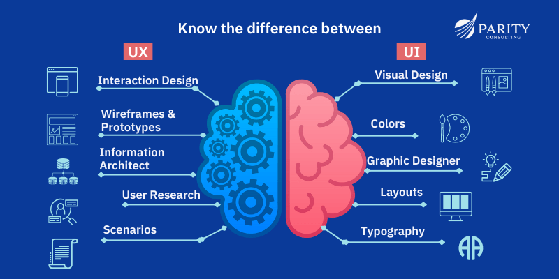
“UI focuses on how a site looks and functions, while UX is about a user’s experience and satisfaction. Both are necessary for creating a cohesive, intuitive flow through an app, product, or website.”
So what does UI and UX mean for Netflix and Disney+? Well, they mean to separate the different aspects of a site/app. UI focuses on aesthetics: animations, typography, imagery, or buttons. Meanwhile, UX focuses on physical interactions: readability, navigations, or usability. Without UX and UI components, you would be implementing features that serve no benefit to the user and their experience. You want people to stay on your platform.
The Model
Now that we understand these factors, let me explain the model that each analysis would be based on:
“ ________ makes me FEEL ________ because my NEEDS for _______ is/isn’t being met.”
Why this model? The model takes into consideration the user’s feelings and how they relate to your needs. You feel a certain way because your need is or isn’t being met, just like how UX and UI design psychology works. Here’s an example:
“The Starbucks preorder feature makes me FEEL HAPPY AND RELAXING because my NEED for COMFORT AND EASE is being met. The drink that I brought is virtual, and I don’t need to be in person for the purchase. This makes time and travel easier for me as a whole.”
The Analysis: Netflix vs Disney+
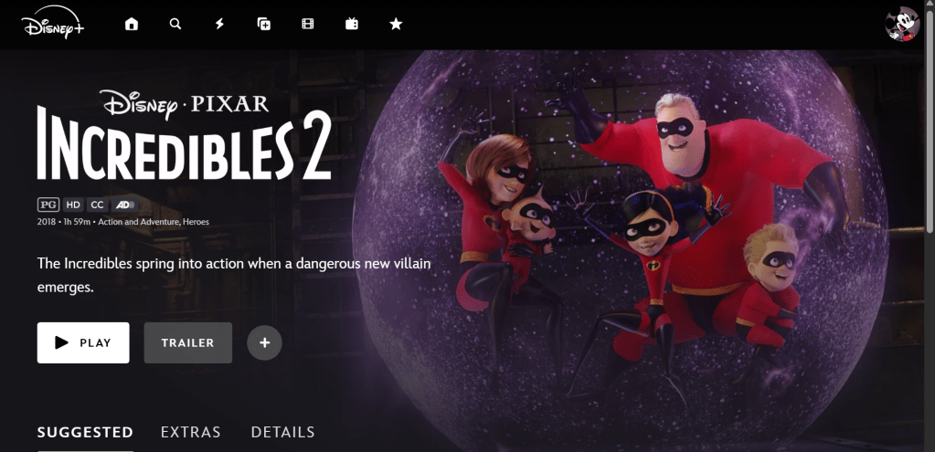
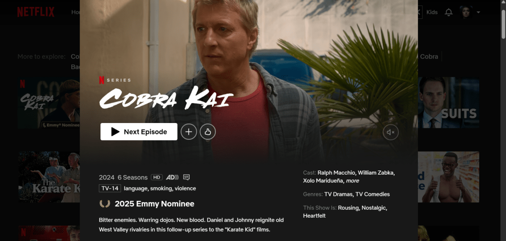
With the Feel/Need setup prepared, I looked at major factors about Netflix’s and Disney’s websites. There were four important sections I wanted to look at for the website analysis: their homepages, their movie/show categories, their search bar pages, and the pages where movies and shows are shown. I wanted to focus on these pages specifically because no matter what, each page would lead to the ultimate goal: watching a movie show.
- The Homepage
- The Atmosphere (hierarchy, color, and organization of each page/list)
- The Animation Quality
- The Category lists
- The Search Page
- The Movie/Show Info Pages
- The Playability features of a Movie/Show
What I found shocked me. On Netflix and Disney+’s different pages, I felt a wide range of emotions. Happiness, engaged, calm, peaceful, intrigued, amazed, surprised were many of the notable ones. I felt these emotions because each feature satisfied a need that I have. Ease, comfort, trust, understanding, clarity, and more. Navigation, organization, and clarity were my biggest needs. If I don’t understand something or if something is troublesome to find, then I don’t feel good.
Using the Feel/Need statement also provided causes a new section in my analysis to be made, the difference section. In this area, I put three notable features for both Netflix and Disney+ that made them stand out. Like, I didn’t know this, but did you know that Disney+ has faster animation timings? When I recorded the times, I found that Disney’s faster animation made the experience better for me. But Netflix also had great features unique to them. Like while Disney+ and Netflix have ranking systems, Netflix has two different types: one for movies and one for shows. Disney has a combined one, but I thought Netflix’s was more useful since I could see shows and movies separately and not together.
Why Should You Take From This Analysis?
After I finished up my research, I took some time to reflect on what I learned. For starters, many of the components that I liked from each website revolved around both UX and UI principles. I found navigation helped me find what I was looking for better, but color and atmosphere added to the feels of the sites. Two, despite being similar, Netflix and Disney+ didn’t feel the same. Sure, they have similar features, but each provides a different experience overall. Three, there is so much hard work that goes into the sites we view. I think it’s nice that I had the chance to truly see the work that designers put effort into making our experience on the sites easy and investing.
Here’s the final report if you want to check it out!

Leave a comment